Graphs
Justification
Graphs will allow you to identify trends, anomalies, relationships and differences within and between your data sets. You need to select the most appropriate graph for the data that you wish to represent and be able to justify that choice (and why you didn't select other methods).
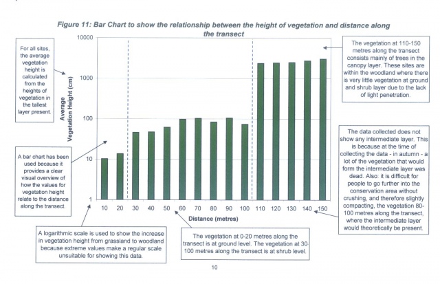
Example 1 - Bar Graph
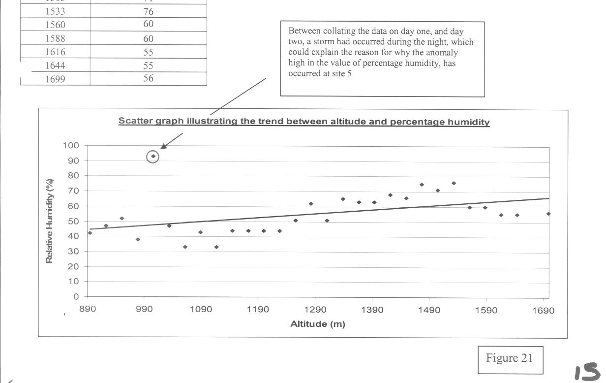
Example 2 - Scatter Graph
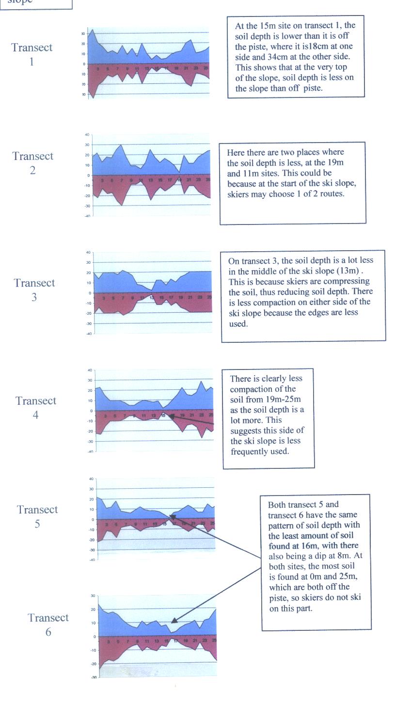
Example 3 - Kite Diagrams
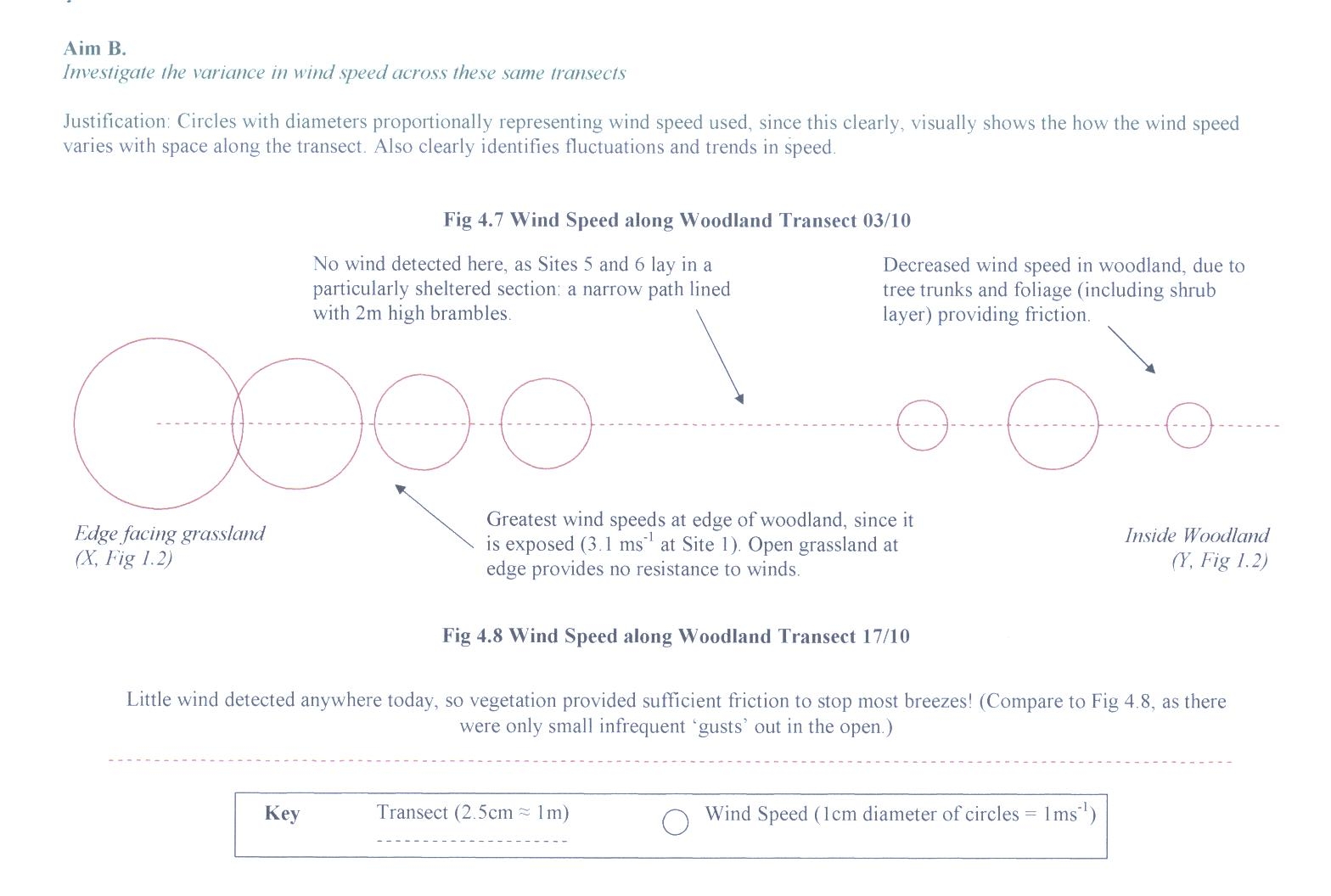
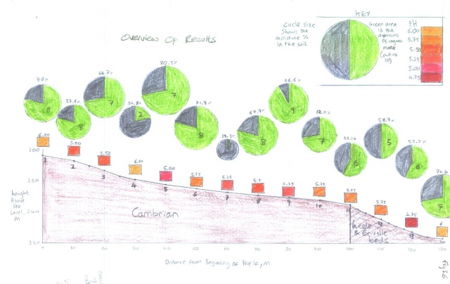
Example 4 - Proportional Cirles
Example 5 - Pie Charts
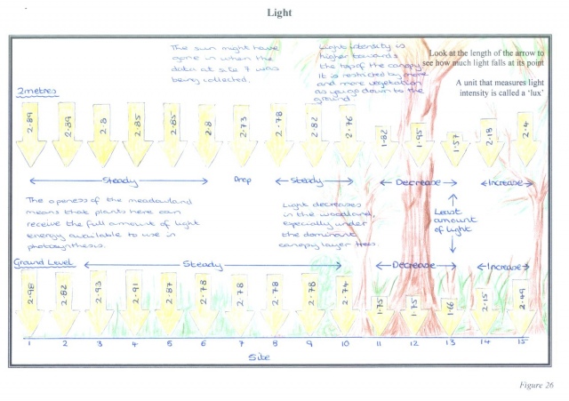
Example 6 - Proportional Arrows
|